Flame & Stone Pizza
Flame & Stone Pizza is a busy takeaway selling stone-baked pizzas for collection and delivery. This was a full redesign where I rebuilt the structure, tightened the UX, and set clean SEO foundations. The focus was simple: make the site feel professional, make ordering obvious, and remove the messy setup holding the old site back.
How I turned Flame & Stone Pizza’s website into a focused, SEO-ready build
Objectives
- Remove template sections that distracted from the main goal (the old site led with a “Mobile App” push instead of the menu and ordering).
- Simplify a cluttered navigation experience so the site feels calmer and easier to scan on mobile.
- Fix trust-killers in the WordPress setup (a public “Hello world!” post visible to anyone).
- Remove/avoid indexing of placeholder pages that contained lorem ipsum and incorrect contact details.
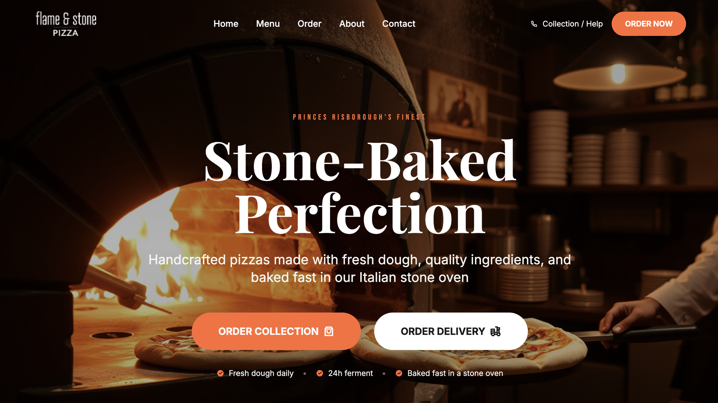
- Rewrite the homepage message so the quality story is clear fast (fresh dough, 24-hour ferment, fast stone-oven cook).
- Build an SEO-ready structure with proper pages, headings, and internal links instead of one long template scroll.
What I built
I rebuilt the site as a clean, focused marketing experience with a proper page structure instead of everything living on one long template layout. The new flow is straightforward: understand what they do, see proof, browse a simple menu preview, then order.
I used a consistent layout system across pages so customers always know where they are and what to do next. Key calls to action show up in predictable places (header, hero, and after decision points) so ordering never feels hidden.
I also tightened the content blocks to remove noise. Less scrolling, fewer distractions, and a clearer story that matches the quality of the food.
SEO & site structure
I set the on-page SEO foundations properly: clean page titles and meta descriptions, a clear heading hierarchy, and internal linking that matches how people move through the site.
Content is grouped so both customers and search engines can understand it quickly. Each page has one job, with supporting sections that answer common questions without filler.
Where it made sense, I structured the content so the business reads clearly as a local takeaway brand rather than a generic template site.
Technical build
I delivered the rebuild as a lightweight, performance-first site (hosted on Cloudflare Pages) with clean HTML/CSS and no unnecessary bloat. That keeps load times fast and the experience smooth on mobile.
I set up simple tracking for key actions (especially order button clicks) so performance can be measured and improved. The structure is also easy to maintain: core text and key sections can be updated without breaking layout.
Result: a cleaner build, fewer moving parts, and a site that feels more trustworthy the second you land on it.
Impact & next steps
This site is designed to increase orders by removing friction: clearer messaging, cleaner navigation, stronger trust, and a direct path to the next step. It also supports better local visibility because the structure and content now make sense to Google.
Next steps are simple and scalable: add more “popular picks”, expand menu preview sections, publish a few local intent pages, and iterate the CTAs based on real click data. No rebuild needed — just steady improvements.